Monday, August 20, 2018

Thank you and farewell...

Thank You Web Design Class of 2018...
Thank you to all my great students from this final Web Design class. There were some very impressive portfolios and projects and I thank you all for your hard work and dedication. I know every student walked away with new skills, insight and abilities from CTE Web Design.

Unfortunately this class has been cancelled by the Santa Cruz Board of Education due to low enrollment numbers. I have taught web design at Santa Cruz High School for 8 years and have enjoyed every moment of teaching web design and coding to the awesome students at SCHS. Web design was a course that provided UC A-G fulfillment in Arts as well as provided articulation with Cabrillo College. It was my honor to provide high quality CTE education in web design and hope to once again in the future.

Please view the quality work from our 2018 portfolio winner Alicia Buchter: Alicia Buchter Portfolio


This blog will no longer receive updates. See you in on the rift cyber warriors...

- Mr.W

Wednesday, June 6, 2018

Design Contest: Design The "_________" Of The Future!

Hello Students,
Our final class exercise is a design competition. This is not a graded assignment but there will be a prize for the finalist.


BMW M1E Electric Prototype Automobile Design Concept by Seth Wilson

Challenge: Your design challenge is to create the "_____" of the future. Imagine what a cell phone might look like in 10 years, or perhaps what will new automobiles look like. There is no limitation of the subject, you could even design the coffee cup of the future. Think about how products change and evolve over a very short amount of time. What did cell phones look like 10 years ago or 20 years ago? What everyday item can you see becoming even more advanced over time? For this challenge, I as your instructor cannot aid your efforts, you must rely on each other to problem solve.

Time limit: 1 Hour, Designs must be completed and ready to present at the deadline

Format: Final artwork must be displayed on screen as a still image or slideshow presentation. Consider that your sales pitch is as important as the merits of your design. You may use any and all resources available to visualize your design but derivative work will be disqualified (no repurposing of pre-existing concepts, designs, etc... don't steal someone else's concept design and pass it as your own basically).

Judgement: While student input is taken into consideration for judging the finalists, the ultimate decision will be made by me. I am judging based on design originality, quality of illustration and details included with your concept. What makes your product/item futuristic? What materials are it made from? How is it powered? Is your design feasible? Is it beneficial, will it sell, is it even possible with existing trends in technology.

Advice: Take a few moments to think of your idea, research similar products or ideas, research current "prototype" concepts already in existence, take inspiration where you can. Check out my own design for an electric sports coupe below.

Presentation: Be ready to present your design to the class. Be prepared to discuss the details and advantages of your design to the class.


Wait for my mark to begin!

Previous Student Design:
Ambulance of the Future by Ray Kaiser

Friday, May 25, 2018

Web Design Final Project

Hello Students,
For our final project in web design class you have a few choices to consider. My main concern is that your final project utilizes your skills gained or enhanced from this course. Think of the options below and choose one option to proceed with...

Choose from one of the options below and begin your final project asap:

  • Reverse Learning Project (see details below)
  • Create a website for someone that needs one, could be a teacher, coach, friend or even yourself. This website should meet all requirements for mobile use and browser flexibility. I can provide hosting temporarily for your project.
  • Create a game, this could be a flash game or an HTML/JS/PHP/Etc game. The type of game is your choice. Look up a cool tutorial if you need some guidance. Some choices might be a choose your own adventure text/image based game.
  • Propose your own idea. Do you have an idea for a final project? Speak to your instructor to get it approved!


Web Design Reverse Learning Project:
In this project you will research, write and guide the class through a learning exercise. Use the internet to research a specific topic or activity or use your own knowledge as a base for creating an engaging exercise. Follow the guidelines for writing interesting lessons below and be ready to present to the class. You can use movies, powerpoint presentations, hand outs or online resources to enhance your activity.

Use all resources available to write and develop an fun exercise or activity that can be taught to the class in about 10 minutes or so. Follow the structure laid out below to format your lesson. Teach the class a skill that is useful and relevant to using computers, creating digital media, using the internet or other related IT skills, techniques or concepts.

Getting Started:
  • Think of something you would like to teach to the class, must be related to web design, digital media, IT, internet or digital literacy skills... it could be a cool piece of code that enhances a website or a cool trick or hack you learned... thing of something fun that everyone can try
  • Use the internet to research and gather resources, assets and information
  • Use presentation software like powerpoint to create a presentation or use work to create hand outs, you could even use a video to help deliver your information or to engage the audience
  • Follow the structure laid out below to create a compelling activity, a good lesson will have a hook to get the audiences attention peaked, information should be presented well and there should be some kind of hands on activity.
  • Be ready to present and teach the class
How to write a good lesson for instruction:
Follow the outline below to create your lesson or project, try to have something for each section detailed in your presentation. Use my model lesson as a guide if you need more clarification.

Objectives and Goals: State the objective or learning outcome for your project. What do you expect people to be able to do when your lesson or activity is complete

Hook or Anticipatory Set: Use something to engage the audience and get their brains primed for learning. This could be an interesting image or even a video or a prop. It should be relevant to the material you are covering in your lesson

Lecture or Present: Talk about the material in your lesson or activity, provide some background information or history that is relevant. Discuss or present details about the material. A few bullet points or slides and images are all that is needed to frame the activity

Hands On Activity / Guided Practice or Independent Practice: Have a hands on activity for the class to engage in, or an independent practice activity for students to put their new knowledge to work

Model Lesson: How To Customize The Icon Of Your USB Flash Memory Thumbdrive:


Friday, May 11, 2018

Explore Programming Languages with Code Academy

Hello Students,
In this modern tech industry having a well rounded skill set in web design and programming languages is incredibly important to staying in demand. HTML and CSS are just the first components to creating websites that are compelling, interactive and intuitive. In this project you will explore other languages, complete 3 programming goals and complete one entire lesson in the language of your choice.

A gifted mathematician, Ada Lovelace is considered to have written instructions for the first computer program in the mid-1800s
Web Programming Language Exploration Project:

Log into Code Academy and find the language skills section:

    When you have completed these modules, you must choose one of the following languages and complete its entire module:

    • Javascript
    • JQuery
    • PHP
    • Python
    • Ruby
    • Learn Git
    • Learn the Command Line

    Have fun! All progress should be complete by the 25th!

    - Mr.W

    Wednesday, May 2, 2018

    New Assignment: Portfolio Website

    Hello Students,
    Your next assignment is to create a portfolio website that documents the skills you have developed in this course, documents the work you have completed in this and other courses and displays your prowess with writing html and css and incorporating graphics into your website. Your portfolio site must be rich in graphics and utilize the techniques from our previous projects. You are also required to write about yourself and to complete some research and write about your possible future career path, whatever that may be. You may draw upon and incorporate work you have completed from any previous ROP class, or can include examples of any work or projects or other classes or even hobbies that you are particularly proud of.

    The organization of this site should mirror the ROP Career Portfolio structure.  Review the portfolio handbook in detail for tips on writing your letter of introduction and creating the other sections of your website. Download the ROP Portfolio Handbook to use as a guide for creating your own portfolio website.

    Portfolio Website Technical Requirements:
    • Your portfolio website must have the following sections:
      1. Front page: file must be named index.html for proper functionality. Think of this as the cover of a book about you. This page can contain your letter of introduction
      2. Career Development: This should contain your resume, your career research assignment and your letter of recommendation.
      3. Work Samples: This can be multiple sections, this should include graphic projects, animations, written assignments, lecture notes, artwork, previous website projects, etc. Anything you have created that makes you proud should be included as long as it's content is professional. Written details about each work sample must be included
      4. Contact: This page can contain your email and any other links or contact information, no phone #'s or mailing addresses
      1. This project must be created or edited with a text or code editing program such as Komodo
      2. This project may utilize a platform that provides mobile ready responsive design, W3C.CSS/Bootstrap/WordPress
      3. Each page must display your web page title or name in the <title> area and self explanatory, such as "Seth Wilsons ROP Web Design Portfolio"
      4. Each page must contain the HTML 5 DocType declaration that will enable you to use the HTML Validator, your pages should strive to validate 100%
      5. Each page must contain the character encoding meta tag for utf-8 and each page must be formatted for utf-8 when created
      6. Each page must contain either graphic buttons or text links to the HTML and CSS validators. Make sure you use the code to validate as HTML 5. Put these at the bottom of the page or incorporate them into your page design so that they are not obtrusive
      7. Each page should contain colors for text, backgrounds and link states
      8. Each page should use the same font families and use consistent sizing, spacing and style
      9. When complete the entire website must be less than 20Mb in file size

      Portfolio Content Requirements:
      • Have an example of everything required in the ROP portfolio handbook, letter of introduction, letter of recommendation, resume, work samples
      • Take a photo of yourself to include in the front page, this photo can be turned into an illustration with Illustrator or processed with Photoshop if you like. A camera can be provided upon request.
      • Research 1 possible career you are interested in and write a 1 page paper about the career, what does it involve, what is the salary range, what kind of education do you need, how do you break into the career. Include this in your "Career Development" section. 
      • Show your best or favorite work samples in the work samples section of your website, minimum of 3 examples must be shown, more is encouraged. You can include work from other art, design or ROP classes. Write a 1-2 paragraph summary for each work sample.
      • Include your resume and letter of introduction in the career development section if your website. Do not include phone numbers or mailing addresses, only email addresses for contact info.
      Design Style:
      • Your website should be professional and clean looking
      • Your website layout should be easy to navigate and text should be easy to read
      • Each page should show the same menu at the top for easy navigation
      • Your website should show good design choices for fonts, colors and style
      • Your website should demonstrate the techniques, skills and abilities you have studies during the course of this class
      • Your website should be viewable on mobile devices
      Website Flow/Organization:
      Your website must follow the flowchart below as closely as possible...


      Meeting the minimum requirements above does not guarantee an A+. You must put the time and energy into the project and really use it as an opportunity to shine. Include more material and content and information to guarantee a stellar grade. Must be original work that you created, create some artwork, take some photographs, make a movie, write a paper... this is your portfolio, make it shine.


      How To Add Validation to your website:
      Validating HTML and CSS is a great way to demonstrate your coding skills. Use the code below at the bottom of your page to add a validate button to your pages...
      This is an example of code to add both HTML and CSS Validate buttons to your webpage
      This is how the Validate code above will be displayed, you could also use an HTML5 logo and CSS logo to make graphical buttons for your validators

      How Your Portfolio will be evaluated:
      • Contains required content and format
      • Well organized
      • Free of grammar errors
      • ROP related work samples
      • Shows creativity
      • Shows skill development
      • Appropriate for use in job search
      • Professional yet creative appearance
      Final Portfolios are due May 6th!

      Grading for total of 10 points:
      2 Points - Portfolio website meets assignment specs and requirements
      2 Points - Portfolio contains all sections
      2 Points - Portfolio links work correctly and is error free (including spelling and grammer)
      2 Points - Portfolio has no missing graphics or elements
      2 Points - Portfolio turned in on time and is awesome and is 6Mgb or smaller

      Check out these collections of amazing portfolio sites for inspiration:

      Check out these examples of web page portfolio designs from previous students:


      Ok, stay focused, work hard and have fun!

       - Mr.W

      Friday, April 13, 2018

      Intro to Wordpress Project

      Hello Students,
      This new project will put your research, writing and web development skills to the test by using a Content Management System (CMS) to create a website. Wordpress is a dynamic CMS that creates websites with complex components such as mobile ready, dynamic content and can even include commenting/blogging/fields and forms and much more.

      Wordpress Project Process:

      • Log into your wordpress site, your website address is something like "yourname.schs.launchbrigade.com"
      • Add "/wp-login.php" to the end of your domain to see your login screen
      • Once you are logged in you will see the Dashboard for your site. Here is where you may create pages, blogs and add other plugins. You may also use different themes and alter them. Here you may also edit the content of each page and drill down deeper to modify CSS/PHP scripts for custom modifications.
      • That's it! All the editing happens in the browser... update to view your changes and make sure it looks great from the public viewpoint.
      Wordpress Project Specifications:
      • You will be randomly assigned a subject to research for this preliminary WP project, research and gather as much evidence, information, imagery and date that you can on your given subject. These can include text, photos, videos, graphs, diagrams and animation. Record your sources for all information for citation.
      • Create 150 words written content on your subject topic for your informational page.
      • Create a 3 page WP site to present your information. These pages can be split between a Front Page, an Informational Page and a page the cites all the sources of the information you gathered.
      • Modify all editable areas of your theme, no default images/text may be left behind from the original theme.
      Wordpress Tutorials:
      Follow the links and videos below to get started with using WP, making posts and pages and installing themes.

      Links:


      Wednesday, April 11, 2018

      How to Write a Good Great Resume and List of References

      Hello Students,
      Having a solid resume is the cornerstone developing your career. A well written and well designed resume is what sets you apart from other job applicants. A perfectly written job application, a quality resume and a list of positive references is the job seekers trifecta. In this class we will teach you these skills to help in your search for employment. Below is a list of resume writing tips, read over it before finalizing your own resume.

      Link(right click to download): ROP PORTFOLIO HANDBOOK

      Resume Writing Tips:
      Put your typography skills to work:
      Never use comic sans, zapfino or anything difficult to read or is more "expressive" than "rational". Use sans-serif for headers and section titles, pick a complementary serif font for all other text. Limit your fonts to 2, with 1 or 2 modifiers (bold, italic, etc). Also, refer back to our rules on typography in our introduction to typography and utilize those guidelines in your resume. Choose fonts that are complimentary to each other and assist in creating information hierarchy, this helps the reviewer find the information they need quickly. Choose a good sans serif font for your section titles and a complimentary serif font for the rest.

      Have an objective:
      Know the purpose of your resume and edit it for different job scenarios. Having a focused job objective listed on your resume will help you with attaining an interview and getting hired.

      Back up your special skills with job experience:
      List your skills but make sure your listed job experience, training or education reflects those skills. Are you really good at making websites? Let them know how and where you learned that skill.

      Research and use the right keywords:
      Every industry has its own language, research job offerings and pay attention to the keywords that are used. If you put your resume online with a job placement service they will often use certain keywords to search their database for potential hires.

      Be descriptive with job experience:
      A job title will communicate your role, but not the details of your work experience. List the duties, tasks, activities, skills and achievements that were part of your job.

      Format your text:
      Use bold text to start each section. Use bullets for lists. Make the document easy to quickly scan and read. Clarity of format is crucial, you have ten seconds before the employer will move on to another applicant.

      List most recent job experience first:
      This also goes for education, list the most recent first. If your still in High School you can say "future class of 2012", or "Currently attending HS".

      List most important skills first:
      When writing out your skill list make the most important skills the first ones on the list. If you are applying for a web design job, list your web skills first. Change and edit this for different industries/jobs.

      Leave out the obvious:
      It is not necessary to add "available for interview" or "references available upon request". References are standard and expected, and of course you are available for an interview. Thats the whole point!

      Avoid negativity:
      Don't trash talk past employers or state that you didn't like a past job. Simply state that you were looking for future opportunities.

      Go with what you got:
      If you haven't had work experience yet, just list any summer jobs, volunteer experience etc. If you have hobbies that are relevant to the job you can list those. If you don't have a diploma or degree then just list your estimated date for completion.

      Proofread your resume:
      Have your neighbor or classmate read your resume. Sometimes the spellchecker doesn't catch typos. The more eyeballs that see your resume before it gets in the hands of the employer the better.

      Although these resumes contain similar information, styles do vary. Focus on what makes a resume readable, identifiable and effective. It should be unique to stand out from the rest, but not overly expressive as that can make legibility difficult.
      • Download the ROP Career Portfolio Handbook and follow the template to write your own resume from scratch
      • Create a 1 page resume that meets the handbook requirements for all included information
      • Use any program or online tools of your choice to write your resume
      • Demonstrate good typography, spelling and accuracy
      • Make sure your resume shows good information hierarchy so it is simple to read and each section is listed clearly
      • Email or print and turn in your resume  and list of references for credit - DO NOT POST YOUR RESUME ON YOUR BLOG! It contains sensitive information!
      • Due Wednesday

      List Of References Writing Assignment:
      It is incredibly important to develop a great list of references. These references will help you obtain jobs, college admissions or acceptance into special programs.

      Who makes a good reference?
      • Teacher
      • Coach
      • Counseler
      • Present or past employer
      • Family friend
      • Anyone that can speak highly of your abilities, skills and worth

      References to avoid:
      • Anyone under 18
      • Personal friends
      • family members
      • Anyone who cannot speak highly of your abilities or skills

      Important Tips:

      • The format of your references should match your resume exactly, same header, same fonts.
      • Do not include references on your resume
      • Include at least three references
      • All references should be responsible adults who know you well and can speak to your character and skills
      • Always ask whether or not someone is willing to be a reference before including them in your list
      • Verify the contact information before handing over to an employer

      Format:
      Use the following format for your references, using your own accurate information of course:

      Persons Name:   Bob Smith
      Address:            123 Fake Street
                                Santa Cruz Ca, 95060
      Phone #:             (831) 555-4321
      Title and              Business Owner
      work place:         Moland Spring Bottled Water

      Grading:
      Your resume's and reference lists are graded assignments. For a total of 10 points, grading is as follows:
      2Pts - Resume and List of References is complete per Handbook Guidelines
      2Pts - Resume and List of References is well formatted and easy to read
      2Pts - Resume and List of References contains no typos or errors
      2Pts - Resume and List of References are two separate documents with consistent style, font and header
      2Pts - Resume and List of References are emailed to me as PDF files with descriptive file names (don't send a file called "untitled.pdf")

      Have fun!

      - Mr.W

      Thursday, March 29, 2018

      Principles and Elements of Art in Web Design

      "People ignore design that ignores people." — Frank Chimero

      Art and Design elements are the basic units or building blocks of a visual image. The principles of art and design govern the relationships of the elements used and also organize the composition of a visual image as a whole. All imagery, art, design and photography alike, are comprised of elements that can be broken down and analyzed. 

      Look over these posters, the first addresses the principals, the second addresses the elements and provide visual representation or examples of these concepts. Continue scrolling down for written explanations in more detail,  there is an assignment at the bottom of this post to complete. Read the details and ask questions before beginning.


      The Elements of Art and Design
      Space: Space refers to the distances or areas around, between or withing components of an image. It can exist in two or three dimensions. Space can refer to positive space(a shape, such as an apple) or negative space (the absence of an apple shape). It can also refer to elements in the foreground, mid or background of an image.

      Line: Line is the basic element and refers to the wcontinuous movement of a point along a surface, such as a pencil or brush. Line can also be created by the edges of other shapes. Lines can vary in length, thickness and direction.

      Balance: Balance can either be symmetrical or asymmetrical. The balance of an image can affect the focal point of an image. The location of objects, their sizes and colors, textures and shapes all affect the perception of balance in an image.

      Color: Color and particularly, contrasting color is used to draw the eyes attention to certain areas. It can invoke mood and emotion. Color is created in many different ways... but in all color spectrums, there are primary colors, which all other colors are derived from, and secondary and tertiary colors. Certain formula’s exist for choosing colors that are pleasing to the eye, one way is using Complimentary Colors, which appear opposite each other on a color wheel. Colors can be perceived as “Warm” such as reds, yellows and oranges, other colors are “Cool” such as purples, greens and blues.

      Shape: Shapes are what give objects their definition. Think of the silhuoette. Shapes can be organic (curved, soft, random) or geometric (angular, sharp, organized, complex).

      Texture: Texture is perceived surface quality. In art two types of texture exist, tactile and implied. Tactile texture is the way a surface actually feels, such as sandpaper or tree bark. Implied texture is the way the surface of an object “looks” like it feels. This is created with different pencil and brush techniques. In the modern digital realm, texture is a strong ally in design.

      Value: Value is an element that refers to the relationship between light and dark. It can also be referred to as tone or shading. The value of an object helps give it form and depth. 

      The Principles of Art and Design
      Unity: Unity refers to a sense that everything in a piece of work belongs. It can be referred to in the literal sense of course, or just by the way balance, repetition and other elements acheive a design harmony.

      Variety: The use of dissimilar elements. Differences in shape, texture, color, line etc.

      Repetition: This refers to the recurrence of elements within a piece. Color, lines, shapes and other elements can be echoed, often with some subtle variation to maintain interest. Repetition can be random or organized, or express rhythm and patterns.

      Harmony: Harmony is acheived through the sensitive balance of variety and unity. Harmony in color can be acheived by using complementary or analagous colors. Harmony in design is reflected in consistency in style, similarity of components. Harmony can also extend to the use of texture, color, scale etc.

      Contrast: Contrast is the occurrence of differeng elements, such as color, value, scale etc. It creates interest and helps direct the focal point. Contrast helps define depth and space as well. Objects that are closer to use appear lighter, and objects that are farther away often appear darker.

      Proximity: This refers to the physical placement of objects or elements in a piece. Proximity is used to communicate ideas like relation, importance or hierarchy.
      Proportion: Proportion involves the relationship between objects. It is relative to size and scale. Proper proportion is important in implying realism, and skewing proportion can force the viewers perspective to change. One classical expression of proportion is the “Golden Ratio” in mathematics and the arts. Throughout history, the ratio for length to width of rectangles of 1.6 (roughly) has been considered the most pleasing to the eye. 

      Functionality: In the design world, good design is created for a purpose. This is the difference between art and design. Art is created for the aesthetic value, while design is created to communicate. Art is developed by artists often to satisfy personal motivation. Design is created by designers, for clients, to communicate a message or information. Good design must be aesthetically pleasing as well as informative.

      Principals and Elements of Web Research Assignment:

      Penhaligon's is a UK store that sells fragrances among other things. Their flower bouquet ordering website uses clever layering of elements and colorized vintage illustrations to create texture and depth in their site.
      Use the internet and search engines to find websites that demonstrate good usage of the artistic principles and elements discussed today in our lecture. Use correct search terms to collect, cite and explain how each website is utilizing the principle or element. Collect your examples in a single HTML/CSS page that uses clean typography/color usage for emphasis.

      Assignment Specs:
      • Single HTML/CSS page with clean typography and color usage.
      • At top of page display your name.
      • Below your name create a title for your assignment called "Principles and Elements of Art through Web Design".
      • Below your title list the element or principle your are displaying, discussing such as "Line" or "Color".
      • Below your subtitle display a link with a screenshot or embedded image from your website.
      • Below your image write the web site address and turn it into a link.
      • Below your link write an explanation discussing how the site demonstrates the artistic principle or element in question.
      • Continue until all elements and principles are covered, check links and spelling before turning in.

      Assignment Requirements:
      Find a website that demonstrates good usage or approach to each of the following elements and principles and write 1 sentences that discusses or communicates how the site is achieving the use of said principle or element. You should have 8 total references when complete...
      • Elements
        • Variety
        • Repetition
        • Harmony
        • Functionality
      • Principles
        • Line
        • Balance
        • Color
        • Texture
      Display all your examples with screenshots, links, explanation, titles, etc in a single HTML/CSS page and turn in when complete.

      Have fun!

      - Mr.W

      Monday, March 26, 2018

      Web Typography and Career Research

      Hello Students,
      Our next lesson combines both web design skills with typography and researching careers as part of our career development work. Typography for the internet is important for both readability and legibility. We will learn about these features and more.

      As part of your career development module, we will research 1 possible career you are interested in and write a short essay about the career, citing details, salary and pathway to this career. This writing assignment can then be included in your portfolio's career development section...

      Typography for the Internet:
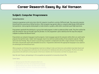
      Here is an example of what you will create for this assignment, a short career research paper formatted for legibility and readability using web fonts from google.


      Web Design for the screen viewing has similar yet in some instances different guidelines for typography. Creating emphasis with proper contrast, layout and alignment is important, but so is type choices and a focus on readability and legibility.

      Readability refers to typefaces that are more expressive and are best used for smaller sets of text at larger sizes.

      The concept of readability is best applied to:
      • Headings
      • Subheadings
      • Captions
      • Quotes

      Legibility refers to typefaces that are best used for smaller text, also called body copy. These typefaces may be serif or sans-serif but above all tend to more rational and readable at smaller sizes. In print a serif is best at small sizes, but for screen viewing a sans-serif can be better for some.

      The idea of legibility is used for larger bodies of text like paragraphs and your font choices should be focused on easy reading for the viewer.
      • Use medium weight fonts, bold and light are harder to read
      • Set paragraphs and blocks of text to a set width that isn't too wide
      • Use type that isn't overly expressive


      Accessing fonts online:
      Google fonts makes it easy to access many fonts online without the risk of a viewers computer missing the font in their system, causing readability issues. Check out the whole collections and try some out for your project.

      How to use google fonts:
      • Go to: https://fonts.google.com
      • Search for a font to use
      • Click the red plus symbol to add the font to your selection
      • Click on the tab to see the code for your website
      • Add the google API code to your HTML page
      • Use the fonts where you like in your CSS


      Check out an example here: Career Research Assignment by Kel Varnsen


      What interests you as a career? Pick one to research for this assignment

      Job Research and Writing Assignment: Part A
      Search for a job title, something your would be interested in. Research 1 jobs and write about why you would be interested in that job. Be thorough!  Tell me information about the job such as:
      1. Job Title
      2. Job Description
      3. Job Activities
      4. Education Needed
      5. Career Pathway
      6. Salary Range
      Assignment Specifications:
      • Complete assignment in essay form
      • Provide formatting opportunities for your html/css (title, subtitle, lists, etc)
      • 3-4 Paragraphs with details
      • 150 Words minimum

      Example Essay:


      Career Research Essay By: Kel Varnson

      Subject: Computer Programmers

      General Description:

      Computer programmers write instructions that tell computers to perform a variety of different tasks. They may write programs that will perform accounting or billing functions. Other programs may operate robots or computer-aided design (CAD) machine tool operations. Some programs allow people to create artwork or graphics, while others coordinate space flight operations.

      Programmers speak with the individuals or groups that need programs in order to understand their needs. They then outline the steps the computer must go through to get the job done. It is the programmer's job to identify all of the steps the computer complete to produce the desired results.

      Programmers use computer languages to write programs. Some languages operate the computers while others are used to write programs that perform tasks. Higher level languages require less technical understanding of how computers operate. They are said to be more friendly. They are easier to use and may accomplish a complicated task with a single command. A less friendly, more basic program will require more detailed instructions. Programmers determine the appropriate language to use, based on the advantages and limitations of each.

      When programs are finished, the programmers must test or debug it to be sure that errors and problems have been found and corrected. Also, the programmers write two sets of instructions for individuals who will use the program. The first is for other programmers who will work on the program in the future. Another set of instructions is written for program users.

      This is a Hot Occupation. Over the next 10 years, job openings in this occupation are projected to increase by at least 27%.
      • Write programs that tell a computer what to do
      • Usually know more than one programming language
      • Spend working hours alone, but often work in teams
      • May have flexible schedules, including telecommuting
      • Often work long hours
      • Have at least a bachelor's degree
      • Earn $61,730 per year (national average)
      • Stay up to date on new programming languages
      Hours & Conditions:
      Computer programmers usually work in well-lit, climate-controlled offices because computers do not function well in environments with extreme temperature or humidity fluctuations.
      Work Locations:
      Computer programmers work at universities, government agencies, and business firms.

      Pros & Cons:
      Programmers like working with computers and planning ways to solve problems. They find their jobs to be challenging. They like working indoors in clean, air-conditioned offices. Also, there are many opportunities for employment in this field.


      Job Research Essay Typography Assignment: Part B
      For this part of the assignment, you will format your essay as a single web page that demonstrates clean and clear typography that demonstrates readability and legibility

      Link for Reading:
      The Two Functions of Type: Readability and Legibility

      Assignment:
      • Format your essay as a html/css document
      • Utilize 3 web fonts for formatting text to demonstrate legibility and readability
      • Layout must be clean and easy to read
      • Typography use should create emphasis
      Check out an example here: Career Research Assignment by Kel Varnsen

      Upload to server when ready!