Typography is an important element to design, communication and information delivery. It is everywhere yet we rarely recognize it. After todays lecture read through this page and scroll down to see your assignment...
THE 19 RULES OF TYPOGRAPHY
(From the book: Digital Color and Type, Rob Carter. Rotovision 2002)
Remember, rules must first be understood before they can be broken. Once you have a good foundation of these rules, you can freely journey into unconventional terrain.
Rule 1: For optimum legibility, choose classical, time-tested typefaces. These typefaces should be drawn and crafted with consistency among characters, and exhibit highly legible proportions. Examples include: Baskerville, Bembo, Bodoni, Caslon, Centaur, Franklin Gothic, Frutiger, Futura, Garamond, Gill Sans, Goudy Old Style, Helvetica, News Gothic, Palatino, Perpetua, Sabon, Times New Roman, and Univers.
Rule 2: Be mindful not to use too many different typefaces at any one time. The main reason for using more than one typeface is to create emphasis or to separate one part of the text from another. When too many different typefaces are used, the reader is unable to determine what is and what is not important.
Rule 3: Avoid combining typefaces that are too similar in appearance. If the reason for combining typefaces is to create emphasis, it is important to avoid the ambiguity caused by combining types that are too similar in appearance.
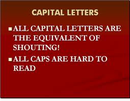
Rule 4: Text set in all capital letters severely retards reading. Use upper and lower case letter for optimum readability. Ascender and descenders provide the necessary visual cues to make text more readable. Text set entirely in upper-case letters form monotonous, rectangular shapes. Upper-case letters can successfully be used in display type (headlines; type above 16 points).
Rule 5: For text type, use sizes that, according to legibility studies, prove most readable. These sizes generally range from 8 to 12 points for text that is read from an average distance of 12 to 14 inches. Be sure to remember that sizes (based on the x-height of letters) appear different from one typeface to another.
Rule 6: Avoid using too many different type sizes and weights at the same time. Some experts recommend using no more than two sizes, one for display titles and one for text type.
Rule 7: Use text types of book weight. Avoid typefaces appearing too heavy or too light. Text typefaces that are too light cannot easily be distinguished from their backgrounds. In typefaces that are too heavy, counter forms diminish in size, making them less legible.
Rule 8: Use typefaces of medium width. Avoid typefaces that appear extremely wide or narrow in width. Rather than distorting text by stretching or squeezing the text width, use type families that include condensed and extended faces that fall within accepted proportional norms.
Rule 9: For text type, use consistent letter and word spacing to produce an even, uninterrupted texture. Letters should flow gracefully and naturally into words, and words into lines. This means that word spacing should increase proportionally as letter spacing increases.
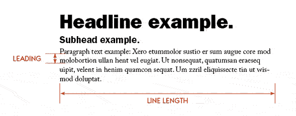
Rule 10: Use appropriate line lengths. Lines that are too short or too long disrupt the reading process. As the eye travels along overly long lines, negotiating the next line becomes difficult. Reading overly short lines creates choppy eye movements that tire and annoy the reader. When working with text type, a maximum of about 70 charters (10 to 12 words) per line is thought to be most acceptable.
Rule 11: For text type, use line spacing that easily carries the eye from one line to the next. Lines of type with too little space between them slow the reading process; the eye is forced to take in several lines at one. By adding one to four points of space between lines of type (depending on the specific typeface), readability can be improved.
Rule 12: For optimum readability, use a flush left, ragged right type alignment. Although in special situations, other type alignments (flush right, ragged left; centered, and justified) are acceptable, the tradeoff is always a loss, however slight, in readability.
Rule 13: Strive for consistent, rhythmic rags (the rag is the right edge of your left-justified paragraph). The purpose of effective rags is not only to achieve aesthetic beauty, but to enable readers to move gently and effortlessly down a text column. Effective rags consist of lines establishing an informal but consistent pattern of line endings.
Rule 14: Clearly indicate paragraphs, but be careful not to upset the integrity and visual consistency of the text. The two most common ways of indicating paragraphs are by indenting and inserting additional space between paragraphs.
Rule 15: Avoid widows and orphans whenever possible. A widow is a word or very short line at either the beginning or end of a paragraph. An orphan is a single syllable at the end of a paragraph.
Rule 16: Emphasize elements within the text with discretion and without disturbing the flow of reading. You can use italics, underlined type, color type, different typeface, small capitals, capitals, bold type within light type, light type within bold type, larger type, and outline type to emphasize elements but never overdo it. Use minimum means for maximum results.
Rule 17: Always maintain the integrity of type. Avoid arbitrarily stretching letters. Well designed typefaces exhibit visual qualities that make them readable. Arbitrarily distorting them compromises their integrity.
Rule 18: Always align letters and words on the baseline. Letters are designed to coexist side-by-side on an invisible baseline.
Rule 19: When working with type and color, ensure that sufficient contrast exists between type and its background. Too little contrast in hue, value or saturation, or a combination of these factors, can result in type that is difficult, if not impossible, to read. Be careful when using photos or texture behind text.
Typography Assignment:
Create a cool typographic poster using a favorite quote, like the posters below
- Search for a short quote about one of your favorite subjects or from a favorite author or artist, or make up your own.
- Set up an 11X17 document in Illustrator
- Create a poster using nothing but text, you can manipulate the text to illustrate your quote
- Make a cool background for your poster, keep it subtle
- Use colors that are easy to read and create impact
- Think BIG! Big text, big message!
- You should have 2 fonts maximum
- You should show variance in size/color etc...